The Clay Studio is a non-profit arts organization whose high-quality classes, programs, and exhibitions foster community and artistic expression around the medium of clay.
The Client Need
As The Clay Studio planned for continued growth in their programs and physical space, they sought an online presence that could represent their engagement in both local and international artistic communities.
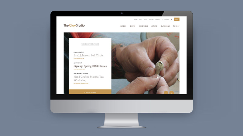
After completing a rebranding project, The Clay Studio engaged P’unk Ave to extend their new visual identity to a website that would showcase their comprehensive artistic and educational programming. They sought to simplify online engagement for their online visitors, making it easier to understand and discover The Clay Studio’s offerings and to support their programs and artists.
Our Work
Research & Strategy
We conducted research that included artists, staff, board members, and students involved in every aspect of The Clay Studio’s offerings. The stakeholders we spoke with reinforced that The Clay Studio is deeply rooted in community and inclusion, a welcoming place for people of all skill levels and backgrounds to connect and create art side by side. They also highlighted the nationally and internationally renowned ceramic artists who come to The Clay Studio to create, teach, innovate, collaborate, and display their work. We knew that balancing these two ideas throughout the website’s messaging and design would be vital to the success of the project.
Workshop
The Clay Studio boasts a wealth of creativity among its leadership and staff. We led them through workshop exercises designed to capture how their visual style translated into a web experience and refine key brand messages we’d collected in the interview process. Given the high priority of streamlining course registration and shopping experiences, we also led a deeper discussion of the functionality required to improve the process for users and reduce the burden on staff.
Design & Development
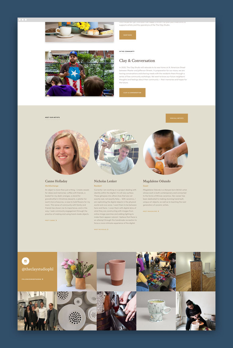
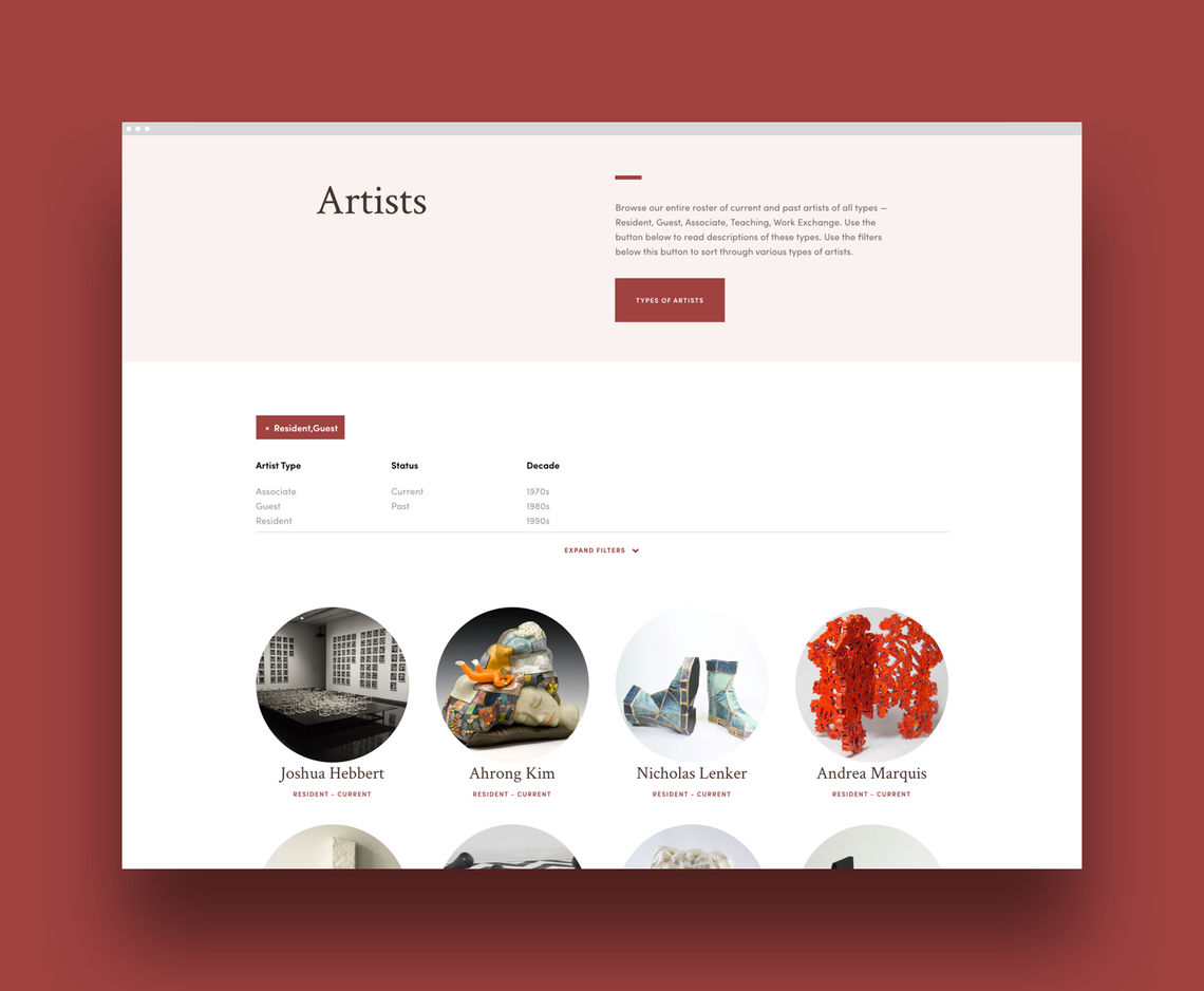
A key consideration of our design was the overlapping roles of people, pieces of art, and programs in The Clay Studio’s work and online presence. We created a circulatory navigation system so that people and objects would be discoverable from other page types.
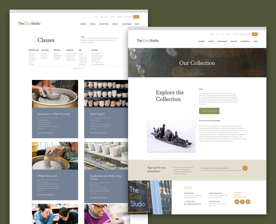
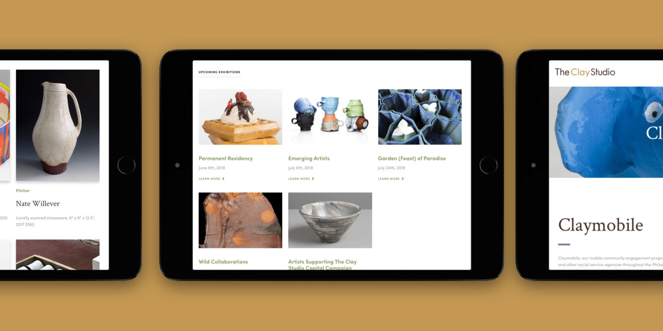
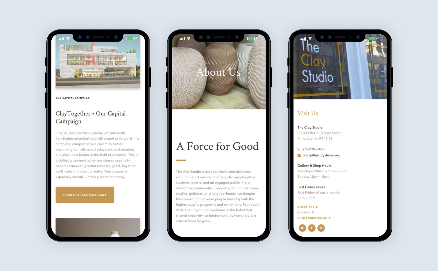
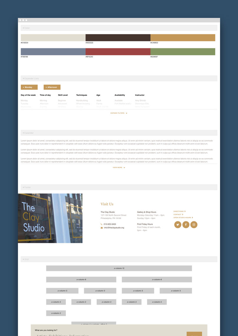
The Clay Studio front-end pattern library.
The Outcome
Expert, but not staid. Cultured, but not old-fashioned. Forward-thinking, but not game changing. We created an online presence for The Clay Studio that balances their role as a prestigious arts organization with their mission of making ceramic art and education accessible to people from all walks of life.
Designing Balance
The website is filled with photographs of art and artists of all levels, allowing the vibrancy of the people and the artwork to stand out against the natural tones of the color palette.
Managing content
Our developers translated the designs into widgets and templates and integrated them into ApostropheCMS, an open-source content management system. We trained The Clay Studio on how to use ApostropheCMS’s in-context editing tools to edit and add content, in real time, as their organization expands and changes its offerings.
A consistent look for third-party services
We also delivered a front-end pattern library, with user interface patterns and page templates that could be integrated into pages powered by The Clay Studio’s e-commerce and course registration system.
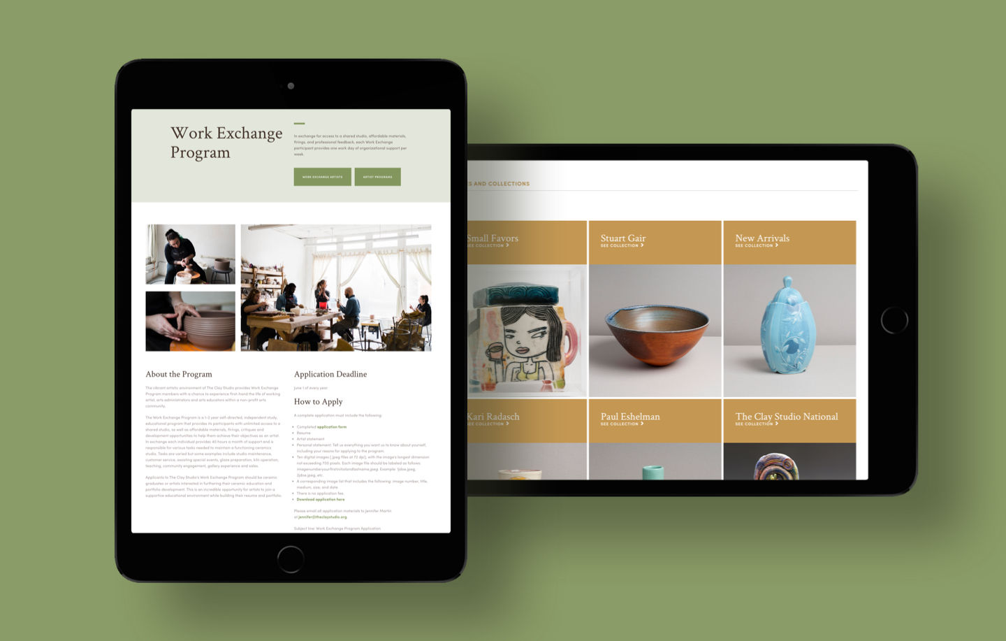
"At The Clay Studio, we're very hands-on and cross-trained, so it was a real win for us to be able to share the content management of our new website among our leadership staff, support staff, work exchange students, and interns. This kind of functionality allows us to work at our best — as a team. Thanks to the modular widget structure, our new website has a consistent look and feel across the board, and it renders seemlessly on both desktops and mobile devices. Best of all, our new site better connects our online shoppers, collectors, and researchers with our artists and exhibitions, puts our student audiences in touch with our teaching artists, and links up our event guests, local artisans, neighbors, and supporters. We're all about bringing people together around the art and craft of clay, and our new website reflects that, visually and functionally."